A little bird told me...
What can twitter data tell us about word choices? Also: where to get high-quality W/NBA shot data, and cheesy visualisations
Welcome to another issue of V/N! This week’s main article takes a look at social media data as a change of pace from the sports analytics of the last few weeks.
Also in the issue: creative & cheesy visualisations, and where you can get great, high-quality basketball shot data, which more than a few people ask about on a regular basis.
Enter the Twitterverse
My relationship status with social media would be best described as: “it’s complicated”. I just can’t quit it. I would bet that the same is the case for many of you.
The problems with social media notwithstanding, the thing is, it can be fun. It provides unprecedented ability to disseminate the latest memes, pet videos and pictures of time-travelling Sesame Street characters captured in classic art.
From a data perspective, social media is a rich vein of data to be mined - sure; it’s mostly used by advertisers or the host companies themselves, but it’s also accessible to the rest of us. Twitter provides an API with a free tier, so I collected a set of tweets (using a Python package called Tweepy) for this article.
As to what data to collect, I decided to search for tweets containing either of two (nominally) similar terms, to check for similarities and differences between the result sets. The below was based on searches for tweets containing “women” vs those containing “females”, the final dataset including the same number of tweets including each word was included.
It was loosely inspired by having come across pieces like this and this in which the authors highlight the potential adoption of the term “female” as a pejorative. The idea was that if this was true, some differences should show up in the data.
The company you keep
There’s a proverb that says “a person is known by the company they keep”. The same is true for words; so much so that it is a major principle which computational linguistics adopts to great success (but we won’t get into word vectors here).
So, let’s see if there are differences in words commonly used in each dataset.
This chart shows the words that occur most commonly in the dataset (excluding stopwords like “I”, “and”, etc.), and coloured by how often they appear with each subset (“women” or “female”).
Some of these words are extremely predictable words that would be used in speech such as “like”, “get” or “know”. These words also appear similarly often in each datasets (notice the similar lengths of each colour bar as stacked).
But some, like “men” or “males”, are far more likely to appear with one group than the other. That’s interesting. Let’s expand the selection of words, and show this data in a scatter plot with frequency with each (“women” / “female”) subset on each axis, and coloured by whether the word appears more with one subset than the other (i.e. bias).
Interestingly, there appears to far more words that are biased towards “females” than those biased towards “women”.
When the data is filtered to only show words that mostly appear with one or the other subset of tweets, the below chart is generated:
I’m have no expertise in this area so I’m not going to comment on this too much. But the data does look to me as though there’s definite differences in the two datasets. More specifically, looking at the biased words are useful indicators of different tones and possibly also different demographics using those words.
Engagement
The next chart looks at the “social” part of social media, with the proxy metric of RTs.
The chart shows that most tweets have zero RTs; simply shouted into the void by the author, never to be picked up again (relatable for all of us). At least based on our sample data set, the “social” part of social media appears to be … greatly exaggerated.
It is also interesting that one dataset gets a lot more RTs than the other. If I had to hazard a guess I would say that one dataset includes more higher-quality tweets that people are intereted in.
Sentiment
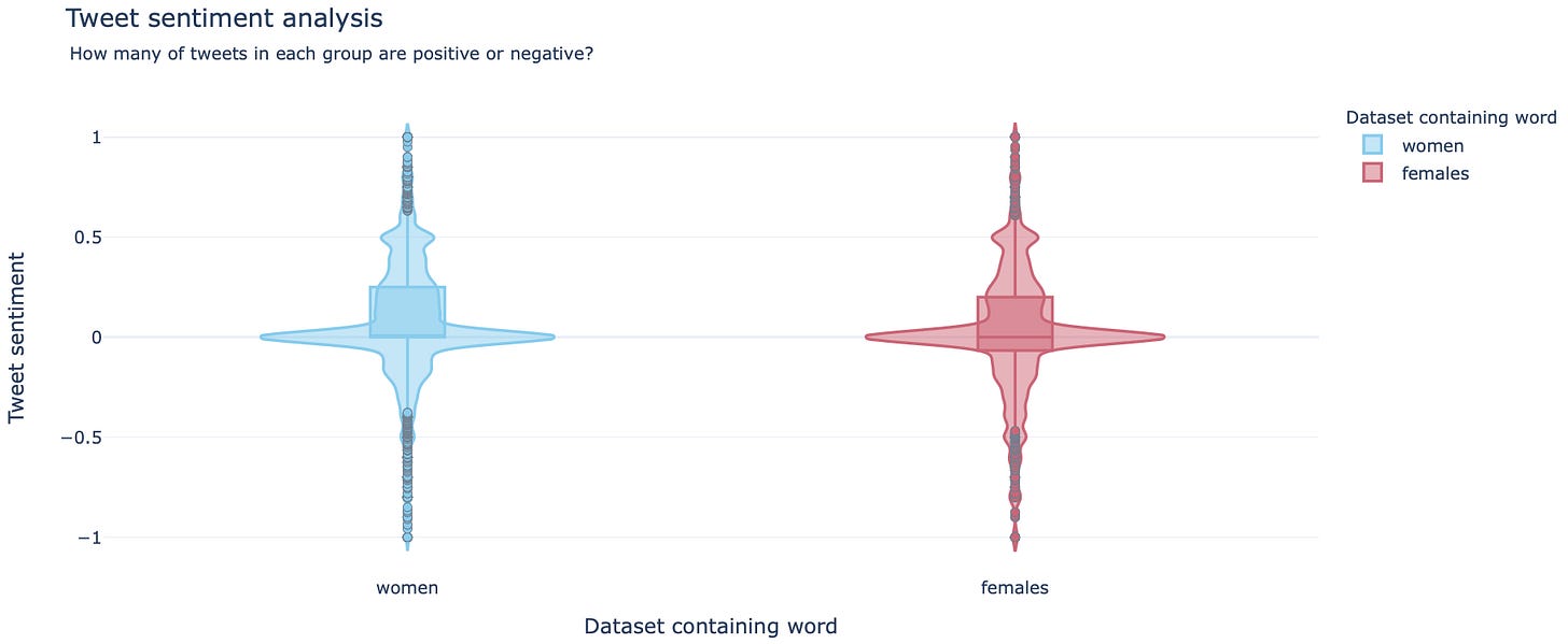
Sentiment analysis is a technique to tell in very simple terms the sentiment (positive or negative) of these two datasets. I used Textblob to determine the sentiment of each tweet and collected the data here.
The violin plots and histograms show subtle, but clear differences between the two groups.
The violin plot shows the “female” dataset to clearly have a lower median value (see the middle line of the box plot), and this can be visually confirmed by the number of negative values in the histogram. It’s a subtle difference, but it’s there.
It looks to me as though there are clear differences between the two datasets. This was hardly a scientific study, so I wouldn’t take it too seriously, but give some thought to using Twitter data to take a look at what people are thinking/saying.
If you are interested in NLP applications or dashboards, here is a web app that I put together with the good folks at Plotly a few months ago (and the associated write-up), which includes examples of named entity recognition or sentiment analysis on Amazon reviews.
Maybe next time…
I wanted to include outputs from some other datasets, but unfortunately ran out of time (and into Twitter’s free API limits). I’d be interested in doing, or seeing, the same with sets of queries like:
Westbrook vs Harden
Twix vs Snickers
NBA vs NHL
Marvel vs DC
If you are doing something similar and run into any issues - feel free to reach out!
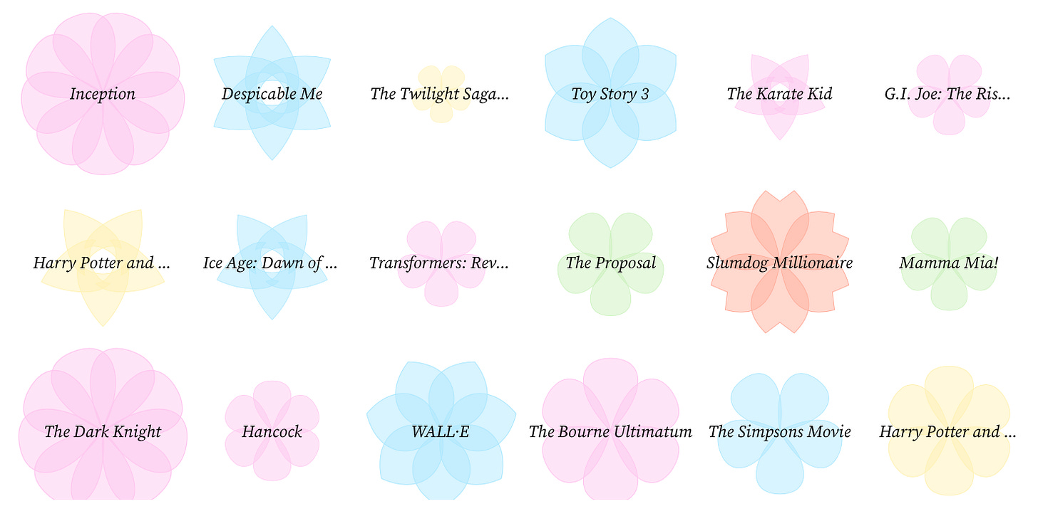
👀 Eye-catchers
Filtration
The NYTimes graphics department consistently comes up with some really pretty, but also more importantly informative outputs.


If you thought the Titanic was bad…
So an entire iceberg is about to hit an island. I guess it’s a silver lining that we now have the technology to beautifully illustrate that terrifying fact.


D3/SVG tutorial
If you’re keen to learn D3, you might want to check this SVG/D3 tutorial on ObservableHQ by Shirley Wu. This is not only the best, but most approachable tutorial I’ve seen on the subject renowned for its learning curve.
💽 Data Sources
WNBA/NBA Data
I’ve just recently discovered that Darryl Blackport (@bballport) not only has a great web app / dashboard on the WNBA and the NBA, but he also makes his data available for Patreon subscribers.
He does great work so I encourage supporting him and his work (I’m not affiliated with him in any way other than being a secret admirer!).
COVID-19 Data
If you would like to put together a COVID-19 dashboard, or would like to just look at the data, OurWorldInData makes their compiled data available on GitHub.
And the NYTimes’ GitHub repository is the best US-centric database that I’ve seen.
Thanks for reading! Don’t forget that you can leave a comment about anything, including requests for articles, feedback or anything else.
JP
If you liked the article, please subscribe:
And share it with others here:


