Bar charts don't (have to) suck
And an exciting announcement or two
Hi there!
I hope you’re having a great summer - hasn’t time just flown by? These two comics encapsulate pretty accurately my feelings about the last 18 months or so.
In the age of the Great Pandemic, we are all time travellers… or something.
Meanwhile, I have a couple of bits of professional news.
News
First, I am part of a team hosting this upcoming webinar along with the good folks from Plotly and Coiled. Here is the announcement:


Join us if you’re interested in anything big data or dataviz.
More news:
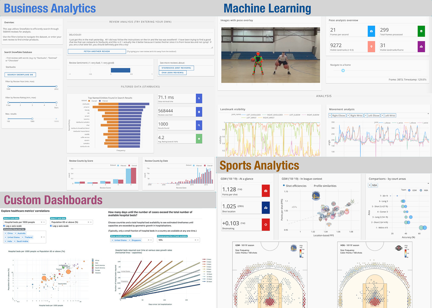
I have started a company! It’s called VisualNoise Data Limited (website). I had been juggling two careers up until this point, and it just came to a point where I needed to commit to one or other other.
It’s pretty scary, but you’ve got to follow your gut sometimes, right?
Initially, the company is going to offer two main services:
Creating custom visualisations
Building data-driven apps, to showcase new and useful data science & dataviz tools as well as to help people learn from them.
So if you’re looking to create custom data visualisations / dashboards, or if you’re a startup looking to get the word out with cool demo apps, drop me a line!
This newsletter will be a part of the new business going forward, and while it will evolve as the business finds its feet, currently I hope to share interesting things or lessons learned, as well as the usual sports analytics / dataviz content.
Now, let’s get onto our regularly scheduled programming…
Constraints -> creativity
Bar charts suck. They’re boring and overused. Some are straight-up insane. Remember this?


Yup. And the thing is, bar charts can be terrible even without bananas.
How many almost-identically styled children of Excel do you see in your web browser or a PowerPoint presentation on a daily basis? You don't win friends with salad, and you probably aren't impressing too many clients with bar charts.
Or so I thought.
I have been working recently with a media company, whose brief was to create attention-grabbing visualisations to increase their online presence and engagement.
My inclination in early stages of this job was to produce charts that I thought would stand out more from the crowd - like these:
The chart on the left shows the frequency distribution of final scores, whereas the right chart shows a team’s record based on where the opponent is in the league standings. They look really interesting, right?
There was just one teeny, tiny, small, minor problem. Almost nobody liked them.
This in retrospect makes total sense, as I went out of my way to make unusual charts - even though they were intended for a lay audience. The result was that most readers would end up confused before subsequently moving onto the next thing. Some (i.e. the client) would get back to their data visualisation expert/idiot (i.e. me) and politely ask him to produce understandable charts.
Data visualisations have one job - to communicate information to the audience. Everything else is gravy. If your audience has to do work just to understand the language of the chart, you’re already losing whole swaths of the audience.
You wouldn’t give a speech to an audience in a language they don’t understand, would you?
So after some trial and error, I ended up going back to the trusty old bar charts for the most part. And I must admit it’s been a really interesting, rewarding design exercise, and one where I am very pleased with the results.
They say that creativity thrives under constraints, and certainly it’s helped me build some interesting variations on a theme.
Here are a few of my favourites, presented with some commentary.
Lego bar charts
This compares the four teams that made the semi-finals of the Euro 2020. There are quite a few disparate stats being presented here, so subplots for unrelated stats are given different stylings for a more distinct look, while maintaining similar visual styles for related stats like goals and shots on target.
The fact that teams with vibrant, primary colours made it to the semi finals is leveraged to give the chart a playful, Lego-like feel.
Highlights
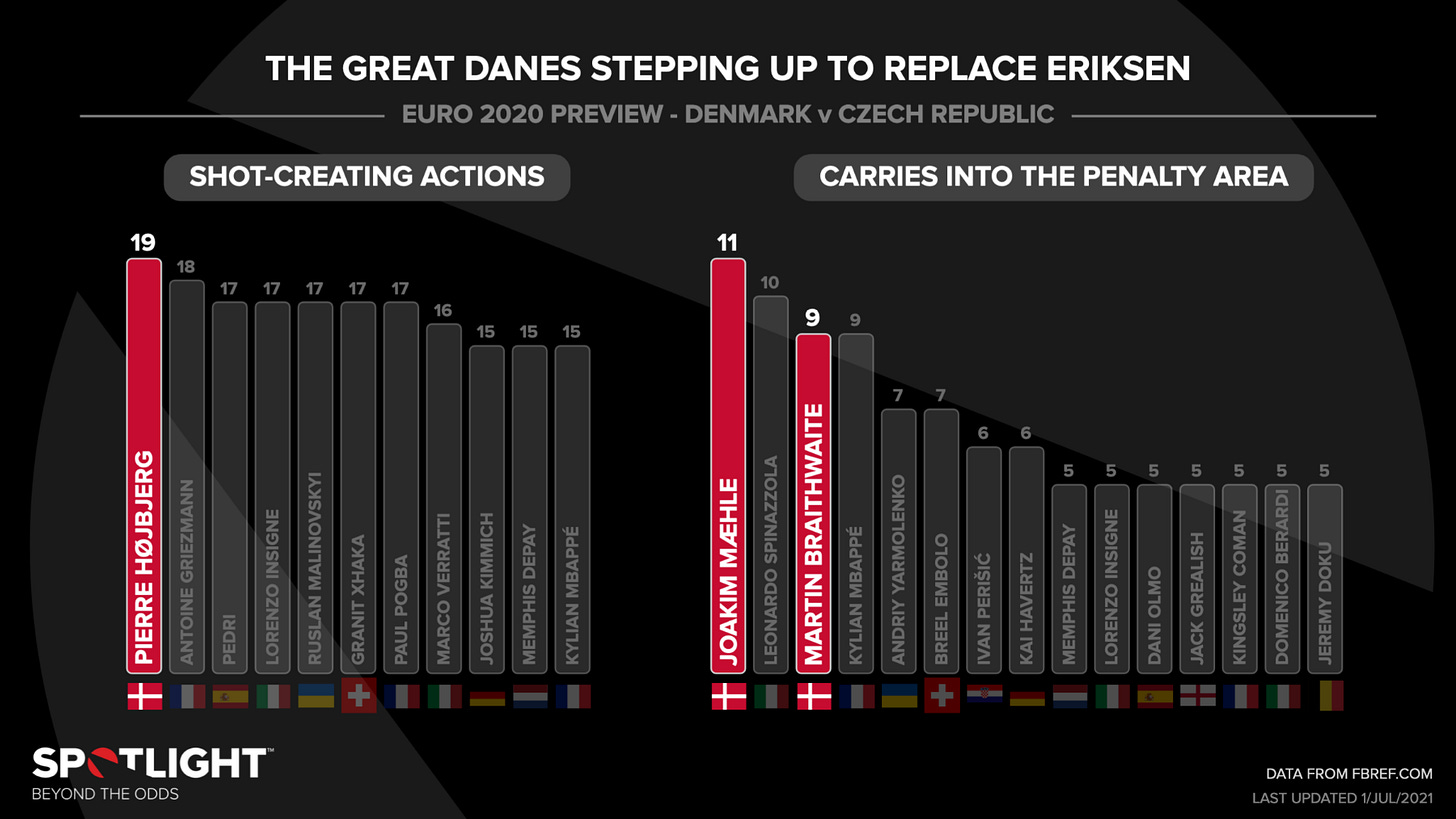
When used sparingly, changes in opacity can really help to highlight certain data points in a set.
Here, colours and opacity help to highlight the Danes. A reader can still dig into the other data points, but the initial impression is unmissable.
This chart presents team data, as well as individual player data for Italy. So the team-level data is shown in colour bars, and player data for Italy broken out into gray bars with colour fills for shots on target, which is a subset of total shots.
2D bar charts
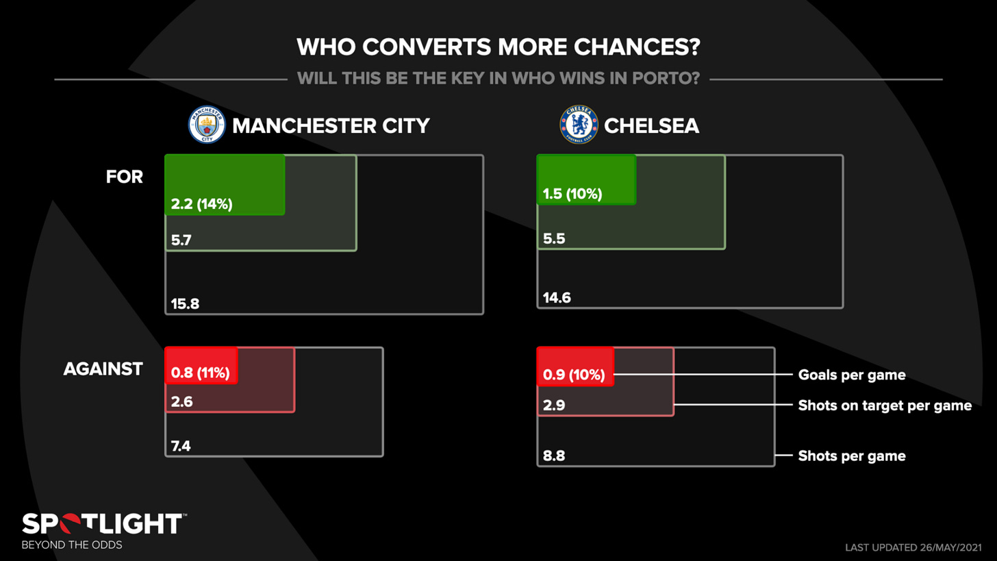
As we saw above, 3D bar charts are usually using one dimension too many. But 2D bar charts, or area charts, can be quite useful.
One challenge of the underlying data here was the large ratios (~1:10) between the key data (goals per game) and the superset (shots per game), where presenting them as stacked or grouped bars would lead to tiny bars representing goals. Instead, area charts allow each dimension for the goals data to be a third of the larger plot, not a tenth.
Discrete vs continuous variables
Here the data presented include a continuous variable (points per game), as well as a discrete variable (wins/draws/losses for each match). To help indicate distinguish these, stacked blocks are used for game results like a waffle chart, whereas points per game stats are presented as bars of appropriate lengths.
Here is another one for discrete variables. This chart shows two teams’ records at FA Cup finals. By sorting each decade into one column, the chart could represent data spanning quite a few decades (and including a huge gap in data points in the middle) to show the two teams’ contrasting recent fortunes.
Pretty diverse for a boring set of charts, right?
I’m sure that’s not even really scratching the surface of what’s possible out there - if you want to showcase your own work, or some others you’ve really liked - please feel free to let me know below or by email!
Eye-catchers
Brutal
This is one of mine, and I have nothing to say here except that I’m sorry for the Danish fans who watched this game. But at least they made the Semis.
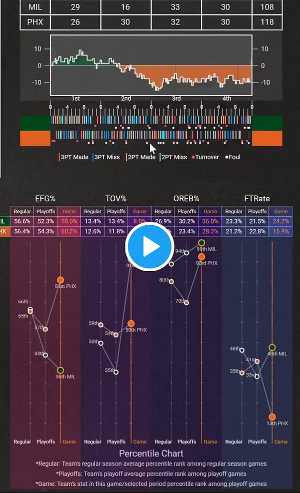
Fancy NBA dataviz dashboard
I’m a big fan of this dashboard, built by Yu Fu of Georgia Tech.


There’s a lot going on here so I can’t possibly do it justice, but certainly worth a look if you’re into sports analytics or dataviz that looks cool as fuck.


Thanks for reading - see you next time :)


