NBA shot data profiling
Comparing and grouping players or teams by shot data
Welcome to this issue of V/N. The main article this week is about using shot chart data as not just visual tools, but as quantitative tools for analysis.
Also - some 2020 year-end visualisations. Merry Christmas / Happy Holidays!
Previously…
A few weeks back, I talked about using polar coordinates to describe shot locations and preferences of NBA players.
The idea was that 1) as the game revolves (sorry) around the basket, and the data at the rim tends to be “compressed” which can be unpacked, and that 2) a polar coordinate system makes it visually easier compare equivalent data from the same distances, as they are now placed on a straight line rather than on arcs.
This next chart for example shows LeBron James’ shot frequency chart in polar coordinates.
Here is another for LeBron’s Finals opponent, Jimmy Butler.
A comparison of these charts (or in the Goldsberry-style charts) reveal that LeBron and Butler have significantly different tendencies. The chart shows Butler’s preferences from his right (left of chart), and LeBron’s affinity for threes from the left wing. They show the two players’ discrepancies in the number of three-pointers (LeBron shoots far more) and Butler’s penchant for midrange shots.
These charts are great tools for comparing players’, or teams’ tendencies. But how might we choose what charts to look at?
It might make sense to look at each team, or the top players. You might even have a specific hypothesis, and generate a charts to test them. But beyond that, the sheer numbers would begin to overwhelm the time available (as well as the willpower of the analyst).
The answer is … in the computer!
Comparing shot profiles
Any visualisation is built on underlying data. And shot charts are no different.
We can think of each shot chart as a set of numbers - where each bubble or point is described as its X & Y-coordinates, size, and possibly colour. It might be written as:
shot_data = [[x1, y1, z1], [x2, y2, z2], ..., [xn, yn, zn]]Knowing this, why not numerically compare one shot profile with another?
The result of each comparison can be captured as a number to assess how similar or different each shot profile is to another.
Here is a heatmap of similarities for a select few NBA teams, based on shot locations during the 2019-20 season.
The resulting matrix here suggests that San Antonio and Denver have similar shot profiles, as do Houston and Dallas.
Let’s see if the actual shot location charts bear that out.
The charts agree with our heatmap above. Both Dallas and Houston take a high number of deep 3s in comparison to the other two teams, whereas Denver and San Antonio are taking quite a few midrange shots.
The same can be done for players’ shot locations to compare their styles. Here are the 15 players who took the most numbers of shots in 2019-20 (loosely sorted by similarity).
Groups of players begin to emerge here. Giannis, Westbrook and LeBron appear as one group, as do Hield, Mitchell and McCollum. The long-distance maestros Lillard and Harden also stand out together, as do Doncic, Booker and Beal.
Again, we can take a look at a few example shot charts to verify some of these results manually.
Not only are the similarities between Mitchell’s and McCollum’s shot locations (and Giannis’ and LeBron’s) self-evident, the differences across the two groups are also obvious.
The analysis can be extended to however many players; 50, 100 or all players, even across multiple seasons.
It is now trivial work to go through 100 players and find each players’ best match. For example, despite being a “point guard”, my fellow Australian Ben Simmons’ closest analogues are centres Montrezl Harrell and Bam Adabayo. Take a look below.
Efficient, right?
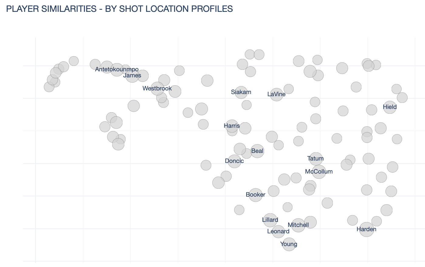
The results can also be used to inform analyses, or to cluster players and teams into groups. Here is a visualisation of player shot location frequency profiles (reduced to 2-D with the UMAP algorithm, only showing 15 example names for readability).
These groupings can be used so that tendencies or players’ roles might be more easily understood.
And even better, this type of analysis doesn’t have to be limited to shot frequency profiles. It can be extended to any type of data - shot accuracies, a combination of shot frequencies and accuracies.
At the next level, the comparisons don’t have to be necessarily limited to comparisons between teams or between players. It could be used to explore data for a team or a player according to situations.
Do certain teams or players play differently when they’re up vs when they’re down? What about in late-game situations? Mike D’Antoni said last year that Rockets tended to not stick to the plan when the shot isn’t falling - is that true? Would we see that in the data?
The point is, numerical comparison of shot profiles means that much of the initial screening can be skipped to save time. Next time out, I’ll show some of the interesting results that I’ve come across.
Eye-catchers (2020 in review)
Here are a couple of visualisations that I thought capture the madness that was 2020.
How it started / how it’s going - Choropleth edition
Choropleth maps can be problematic for conflating geographical size for population. (You might have seen that famous GIF of the U.S. electoral map called “Land doesn’t vote, people do”.)
But in describing properties that apply to an entire area, choropleth maps are perfect.
This is one such example - in describing hospital bed capacity population density is immaterial. This was the projection based on different scenarios in March 2020.
Unfortunately, the actual outcomes look closer to the worst-case scenarios. This is where things stand as of now:
It tells a pretty clear, effective story - that in most states, there isn’t much room to spare (notice the colour scale starts at 70%).
Top search terms
This beautiful visualisation, using Google trends data and google’s colour scheme, was made by Reddit user Informatica6 (Roshaan Khan).
As best I can tell it’s based on the top search terms from Google India. Google Trends makes a subset of their data available here, if you are keen on diving into any of the data.
Vaccine timeline
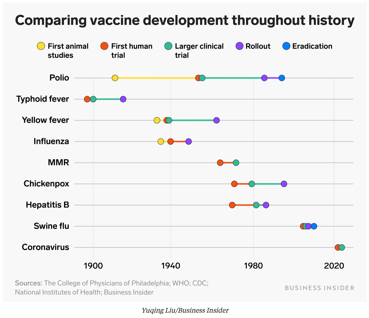
Just to put the speed of the vaccine development into perspective, here’s a visualisation of various vaccine timelines in history.
Yes, 2020 has been the worst, but I’m also grateful that we live in a world where human progress has enabled things like developing and rolling out a vaccine within a year.
I wish you all a Merry Christmas / Happy Holidays, and thank you for supporting this project. I’ve mentioned this before but this is a labour of love and I’m blown away by the engagement and support.
I’m looking to do more freelancing in 2021 so I hope to share some of these outputs with you here also.
Stay safe!
JP
If you haven’t yet - subscribe below!
Or share the joy of this newsletter with another data-nerd friend of yours! 😉


