Transform your data for better insights
First issue! Also - big sports datasets, visualisations of the week.
Hi!
Welcome to this first issue to The Visual in the Noise. I’m blown away by the signups; thank you so so much.
The underlying key idea for the main article today is transforming data using different coordinate systems. The subject matter used is the NBA, but I think it’ll be useful for most data folks. Also I list a few dataset examples & visualisations I’ve enjoyed this week.
We have been visualising basketball shots wrong
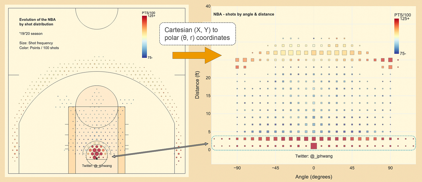
You might have seen basketball data visualisations, with the court divided up into hexbins. Kirk Goldsberry of ESPN/Harvard pioneered these, and many a soul (including myself) have produced them since. They often look something like this:
In these graphs, basketball shots are grouped to describe how often players take a shot from each location, and how accurate they are. The size of the marker indicates frequency and the colour the accuracy (or a similar metric, like points per 100 shots). This has been a huge improvement over just plotting the individual makes and misses on the court, which gets very messy, very quickly.
But, I argue here that it suffers from some significant problems, and we should move away from it altogether.
In its place, I propose to plot shots in a “polar” coordinate system - as shown in an example below.
Here’s why:
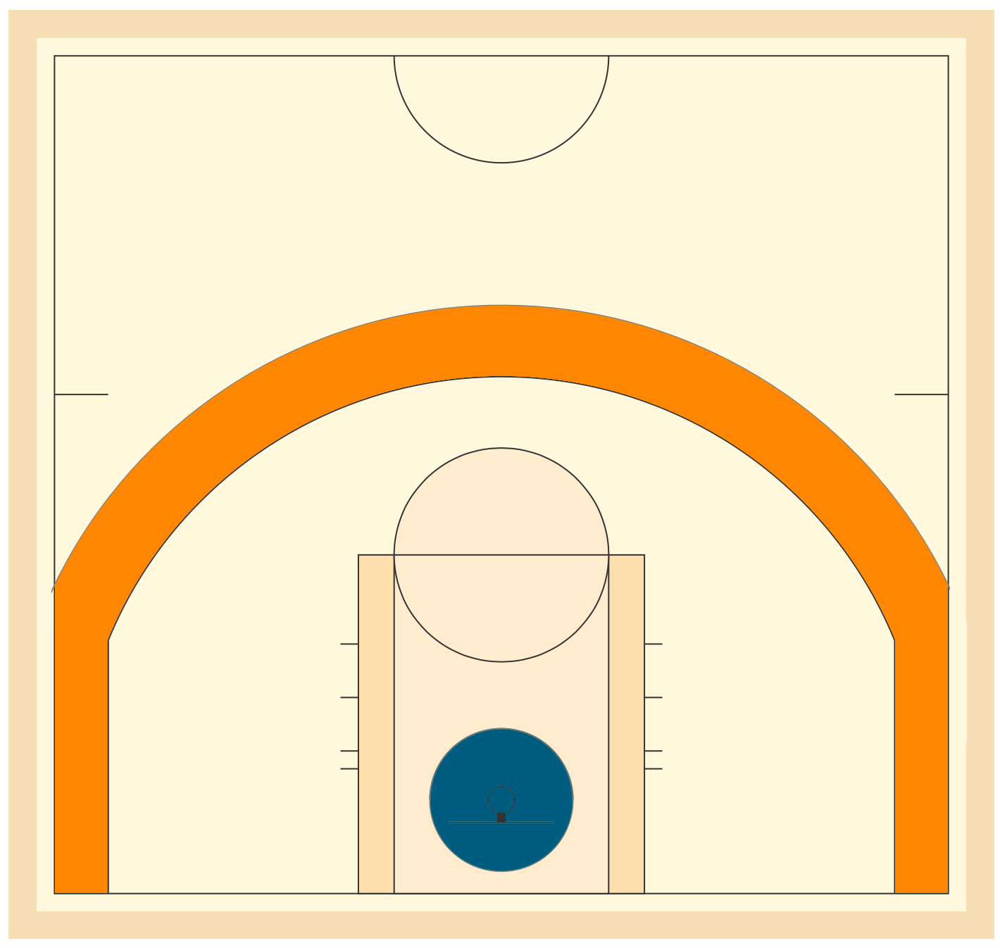
In modern basketball, just under two-thirds (64%) of all shots come from close the hoop (30.4%) and just beyond the three-point line (33.6%). These areas are highlighted below in dark teal and orange area respectively.
The problem is that that the size of orange area is much larger than the the dark teal area around the rim. It is about 6.5 times the size, in fact. So per the same area, about 6 times as many shots are taken from near the basket vs the three-point line. Once again, they are home to roughly the same number of shots by players - i.e. they are roughly equally important as far as shot locations go.
This discrepancy is a significant challenge for visualisation and analysis. As it is, any graph that is created using shot frequencies as marker sizes are dominated by the data from shots close to the rim. Take a look:
The fact is that the density is so much higher near the basket, and drowns out the rest of the data. In most shot charts, this is tackled by “clipping” the data where the maximum value is arbitrarily limited. That’s what the first chart did (reproduced again):
What does this chart show? This chart highlights what are not popular shot locations (areas with small or no hexagons). But there is a cost to clipping the data this way. For one, the areas with large markers aren’t the most heavily used areas.
But the chart makes it look as though shots are taken just as often from many spots beyond the three-point line as they are in the 4-5 foot radius near the rim. As we established before, it’s just not true. They are simply areas above an arbitrary threshold.
On the other hand, designing the visualisation around the data close to the basket would literally minimise the data from anywhere else as we saw. Also, each hexagon in the area near the rim have to represent so much more data - as in, data for 6 times as many shots. In other words, we are losing detail.
How do we solve this conundrum?
I say by changing the way that the data is shown.
Here is the thing. Basketball shots are all aimed at the basket. The data literally revolves around the tiny circle with an 18-inch diameter. So let’s use a coordinate system that is designed to describe data around an origin (basket), based on the distance and angle to it?
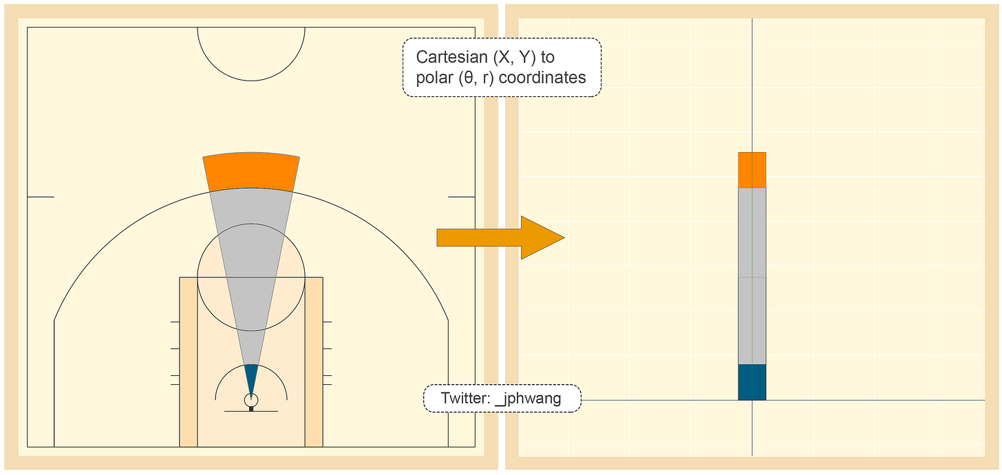
By transforming the data from what’s called a “cartesian” coordinate system (x & y coordinates) to a “polar” coordinate system (theta/θ, radius coordinates), we can eliminate the problem that we’ve been grappling with. With such a transform, each “slice” of the court as shown below can be transformed:
The image to the left is that of a “normal” representation of a basketball court. Notice how small the dark teal area of the arc is near the rim. Now look at the similarly-coloured area on the right. The area has been stretched out towards the centre, providing more space for us to see what happens as the angle around the rim changes, even at the areas adjacent to the rim.
The full dataset, when transformed, looks like this:
The transformed data suddenly gives similar weighting to the two key areas on the basketball court - and we are able to also see the area around the basket in much more detail. The highlighted circular area in red is shown on the right as the rectangular area.
The data shows that actually, the accuracy appears to be slightly higher on the left of the chart (right on the court - imagine looking at the basket).
These advantages are further highlighted when looking at data for individual players.
Let’s start with Dallas Mavericks’ young star Luka Doncic. On the left, using the classic shot chart, it’s difficult to make out a whole lot of patterns - but take a look at the transformed data on the right side.
The chart immediately shows that 1) Doncic is much better from the right side of the graph (his left) shooting three-pointers, and 2) Near the rim (and until about the 15-foot range), he significantly prefers to shoot from the right side, and is much more effective at it from that side. Far more patterns are immediately visible.
The next is Chris Paul’s. The line of red square around the 18-foot distance area shows how effective he is from there, which is, normally a terrible shot for most players. He too, is much better from the left side of the court shooting three-pointers, while better from the right at the rim. It also shows that Paul doesn’t like to shoot much from more than one or two feet beyond the three-point line, AND his accuracy drops off significantly.
And we get to Damian Lillard. The visualisation on the right shows that Lillard is willing to shoot from almost any distance, and is generally great - whether from 27 or 33 feet. He is also a good finisher at the rim; and interestingly - he likes to actually take shots at the rim from the sides (45+ degrees) rather than front-on.
I will not argue that it is the easiest of charts to get used to. But it does have significant utility. Using data presented this way, I would be better able to see which side of the court each player prefers, and what their preferred shot lengths are.
And the utility comes from the fact that the transformation was made to suit the nature of the game.
Which is more likely? That a player’s stat from a spot 18 feet from the rim is more likely to be similar to another spot a foot further, or from 18 feet, at another position on the court. I think clearly, it would be from the same distance at another location.
So it makes sense to group this data by shot distance, and then by the angle. That’s exactly what we have done here with the transformation. The X and Y location on the court are meaningful from the game perspective, but in understanding how a player shoots? Not so much.
This is also visually superior for the reader. When shots are visualised on the court - your eyes must sweep the court in an arc in order to compare shots from the same distance. This is a massively difficult task.
Our eyes are good at telling relative differences, or differences across a linear line. While it is “accurate” to plot shots on the court based on its “real” location, it doesn’t do much for actually learning something about the data.
Polar coordinate systems work well because the game is designed around putting the ball through the basket - and as a result, the distance to the basket is going to be the primary factor, with the angle being the secondary one. The fact that the data is in X, Y coordinates is neither here nor there.
I hope that wasn’t too basketball-heavy for those of you who aren’t huge NBA fans. The main point that I wanted to get across was that the visualisation needs to suit the context of the problem. What data do you deal with in your world that would benefit from a transformation like this one?
Pls let me know in the comments what you thought. Oh, here’s a Wikipedia article on coordinate systems in general if you want to see more.
Edit: This kinda blew up - thank you so much for reading, the nice comments and suggestions. If you liked this, please subscribe to get the upcoming publications as I will definitely be doing more in this space.
Datasets of the week:
NFL BigDataBowl
Dataset (Kaggle): 2.2GB
This provides a rare glimpse into the holy grail of sports data in player-tracking. Usually zealously protected (or ridiculously expensive), this dataset includes contextual (players, play type, situation, etc) data as well as player movement data. A rare gem to be mined.
NBA Data Sources
I get a lot of questions about where I get all my NBA data. While these aren’t necessary datasets, they are great tools for gathering whatever NBA data you want.
MLB Data
Over 400 GitHub stars can’t be wrong - this jack of all trades package allows you to get data from any of the major sources: Statcast, Baseball-Reference or FanGraphs.
Soccer (or football, depending on where you’re from - don’t @me)
I haven’t seen too much high-quality soccer data floating about, unfortunately.
This GitHub repo is the best that I’ve seen as a one-stop repository with some sample data.
This Kaggle dataset includes some secondary data - like attributes from FIFA, and match results.
Eye-catchers:
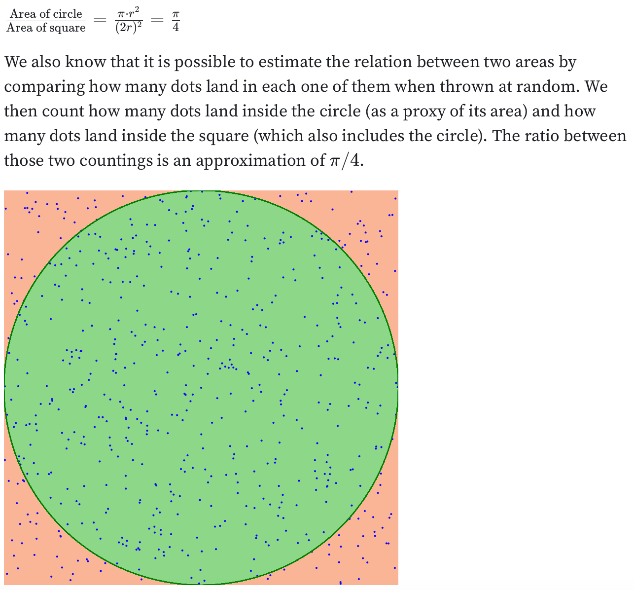
Visual estimation of pi
Link: ObservableHQ
This is a great Observable/D3 notebook on how to geometrically & probabilistically estimate pi. I think it’s a great way to show what pi is, regardless of the visualisation aspect/coolness of it.
A prickly election result visualisation
Link: Website / Reddit post
You’ve probably seen a million different election data visualisations - but this is one of my favourites. Choropleth maps are limited - even I mentioned it regarding problems using choropleth maps.
The author uses spikes on a map to represent the total population size of each county, so the spatial size isn’t conflated with population size. The height of spikes also helps counties stand out even if counties are small.
Thanks for reading! Don’t forget that you can leave a comment about anything, including requests for articles, feedback or anything else.
JP
If you liked the post, you can share the it here:
And you can share V/N with the world here:


Hey JP, great article - I wasn't aware that shot heatmaps were capped! Your updated heatmap plots the polar coordinates on a cartesian map. While this is great for comparing shots against distance from the basket, it is a bit jarring to get used to. Have you thought about plotting the polar points on a polar graph itself? Or is that just too similar to plotting x/y on a cartesian
Interesting idea. Have you run into issues presenting polar coordinates as opposed to Cartesian coordinates? I find it's difficult to translate to nontechnical viewers what polar coordinates even are and why you would do it.
I do really like your scale of PTS/100POS versus the Goldsberry league average comparison too. How did you pick that metric over say, expected value?