When is less more in visualisations?
A follow-up on polar shot charts - are they too complex? Also, some unsightly and eye-catching visualisations
Welcome to another issue of V/N! Thank you for the generous comments & feedback on the previous issue. (If you’ve not read it - I suggest doing do before reading this issue.)
It generated far more discussion that I could have imagined; so this issue follows up on it, especially about the right amount of complexity in visualisations.
More polar basketball

A disproportionate amount of the nice comments from the last issue came from economists! While I was so very elated to see a real-life basketball/economics crossover a la The Undoing Project, it did make me wonder if it meant that I presented the idea a little too technically.
Indeed, some people did comment that these charts were a bit confusing. I don’t blame them. Talk of different coordinate systems aren’t exactly making regular appearances on r/NBA.
So let’s take a look at a simplified version of the polar shot chart.
Is less more?
A simpler polar shot chart could be created based on distances only, to create a profile.
The next chart does so for all shots from the ‘19/’20 NBA season and shows, for each group, its shot frequency (height) and efficiency (colour).
The resulting chart is quite neat. It’s easy to interpret and actually quite informative in characterising a team or a player as you’ll see.
Showing the two Finals contenders:
The charts immediately reveal that Miami (on the right) is more reliant on three-pointers and are generally a better shooting team than LA. It makes sense with Robinson, Herro and Crowder lighting it up from 3, against LA’s power duo of LeBron and Davis.
What would we see if we compared these two classic Texan rivals?
Houston (on the left) basically refuses to shoot twos longer than 6 feet. On the other hand, San Antonio prefers to balance its shot selection by mixing in the midrange shots, and actually shot much better than Houston from the “regulation” length three, contrary to its reputation.
By modern standards, these two teams are truly diametrically opposed foes - as far as shot selection goes.
We can even compare two players. Let’s start with two modern superstars in James Harden and Luka Doncic:
Harden has much better accuracy from deep (27+ ft) and Luka is better at the rim, but notice just how similar their profiles are in shape.
The simplicity of these charts help us to spot differences and similarities where they exist. But simplicity is knife that cuts both ways.
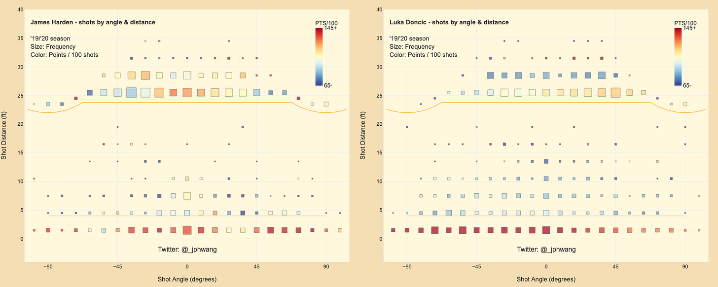
Let’s compare Harden and Doncic once again; this time with polar shot charts.
Both charts are clearly asymmetrical, in marker size (shot volume) and colour (shot efficiency).
Not only that, the two charts show that each player’s favourite sides are opposite to each other!
The bottom row of Harden’s polar shot chart shows that he prefers to shoot from his left (i.e. right of the figure) at the basket, and is much better from there. The opposite is true for Doncic. Looking up the chart and past the orange three-point line, the trend is the same but reversed. Harden and Doncic favour opposing sides. Interestingly, Harden’s most accurate spots are straight on, while Doncic’s is best from his left.
We keep hearing that the strategy against Harden is to force him to his right (and hope for the best). This data shows you a piece of why it makes sense to push the crafty lefty to his left.
What about Luka? Based on this data, I’d want my team to crowd him at the 3pt line and force him to take long 3s, or move him to his right, but also force him left near the basket. Easier said than done, obviously.
Most of these details are simply not visible in the “flattened” data showing distances only. Similarly unique insights emerge when we compare Trae Young and Damian Lillard.
Their distance profile shows them to be very similar, except Lillard is better from basically everywhere, and Young shoots more from 3-15 ft.
And here are the polar charts comparing the two players.
Look at Trae’s shots at the rim (and even in the midrange). His shot profile is more or less contained to within 45 degrees of angle either side of the rim, while Lillard is liable to shoot from more or less anywhere on the court. This has a lot more detail and utility.
So is the polar chart always better? Well, not so fast.
Here is a chart showing the Philadelphia 76ers’ opponents’ shots, based on whether its star centre Joel Embiid is on the court.
With Embiid on (left), the Sixers’ opponents shoot a lower frequency at the rim than otherwise. As expected, really. But there isn’t much of a discernible directional pattern here.
If we look at a simple chart looking at distances only, we get the below.
This chart is far more readable than the above. It shows Embiid’s presence to deter shots at the rim, and cause opponents to shoot worse near the basket.
I’m not sure that I would have picked this second point up from just the polar shot chart visualisations. Here the granularity/complexity has hurt our perception.
What’s “better”? It depends
I worry that for many, the polar shot chart might be too confusing. It occurs to me that polar coordinates are the Uncanny Valley of visualisation - just close enough to “real life” without being it, to confuse the reader.
Just by the way - this is what the court looks like in polar coordinates. I’ve drawn the court outline, three-point line and the restricted circle only, and it is so strange looking. I can’t possibly imagine that this is the way forward for most basketball fans.
Having said that, I am also convinced that the polar shot charts’ have some benefits over “classic” (Goldsberry-style) shot charts. At the end of the day, it’s just another tool, and should be used in the right situations.
I have probably talked about this enough for now. If you are interested, I am going to clean this all up a little, and deploy a web app showing a shot distance profile chart, a polar shot chart and a Goldsberry-style chart, with filters for:
League stats
Team / opponent stats (with option for player on/off filter), and
Player stats
I’ll let you all know when I’ve gotten around to doing that - maybe in a week or two.
Potential alternatives:
One commenter suggested showing a Goldsberry-style chart, but with an insert showing a zoomed-in area.
It also occurs to me that we could make a shot chart showing the court, but with a some sort of non-linear (logarithmic?) scale that expands the space near the rim. That might be quite fun to draw and show a funhouse-mirror version of a court and shot chart showing a gigantic rim. I’m not sure it’d be any less confusing, however.
Please let me know of any other ideas!
The Unsightly:
This is bananas


I honestly have no words. This chart is the dataviz equivalent of this meme - loudly screaming into the void, telling us nothing, and I simultaneously love / hate it.
Eye-catchers:
Polar shot chart: remix
By @owenlhjphillips:


It looks pretty great, if I do say so myself.
Something doesn’t smell right
It looks like quite a few people are getting infected but undiagnosed. 😔


New tricks for an old game?
This was in the ABC’s report of the Aus/Ind cricket match. It’s not ideal that Cricket visualisation has barely changed in the last 20 years.

Just simple things like using red balls on both lines, and cramming what is essentially four charts into one plot increases the degree of difficulty for the readers.
Compare that to this gorgeous sheet from @sportschord:

I know what I prefer.
Thanks for reading! I’m on Twitter: @_jphwang
If you liked the post, you can share the it here:
Or you can share V/N here:


