Who dis? New (NBA analytics) apps
Also - join me at the upcoming webinar!
Hello!
In the previous issue, I talked a little about one of the projects that I’ve been working on. Most of you would have correctly guessed that I was working on some sort of a web app, and you’d be correct. Partially correct.
In fact, (in my best well-actually voice) I built three of them.
If you are a coder, these might be useful technology demonstrations. These were built for Plotly with Dash, which is Plotly’s open-source package for building data analytics apps - with Python, R or Julia. I genuinely think Plotly has built an amazing tool, and I encourage you to learn it.
I should also note that Plotly also offers a bunch of great additional tools and support for enterprises looking to build and deploy AI apps.
But more than that, I hope that you find at least some of it interesting - whether from a sports analytics, data analytics, design, or dashboard building. While they are technology demo apps, I tried to make it as useful as possible, and I am honestly pretty proud of them.
Anyway, enough from me - here we go:
Real-time video pose analysis
This app is all about providing pose analysis outputs to any video, in real-time. Take a look below.
In the clip, the landmarks are being added to Steve Nash in real-time, as the app processes the YouTube clip and identifies body parts.
And as it is carried out, the landmark data can be quantified, displayed, and analysed to learn how the best do what they do, or to identify actual players’ potential sources for improvement. (The app displays data from few landmarks like so.)
The same app can easily be adapted to utilize videos from a webcam, or to compare videos. The real-time nature of these outputs makes it ideal for training sessions, or to see if a player’s in-game mechanics start to falter under pressure or fatigue.
Maybe it could even be used to help quantify degrees of difficulties in dunk contests. (Aaron Gordon was robbed, for the record.)
The pose detection works best when only one or two people are on screen - that’s down to the choice of algorithm that works fast enough to do it real-time for this demo. But it’s darn cool.
Take a look - and I note that you can even put in your own YouTube links.
Check out the video analysis app here
Player Similarity Explorer
Link to similarity explorer app
This app is built as a demonstration of how we might navigate through a large dataset - like, say, a database of all NBA players. We see the endless debates about this on #NBATwitter. Which player is most like player X? Is this type of player unprecedented? How about a player that does Y at size Z?
This app aims to make a start at that. Take a look below.
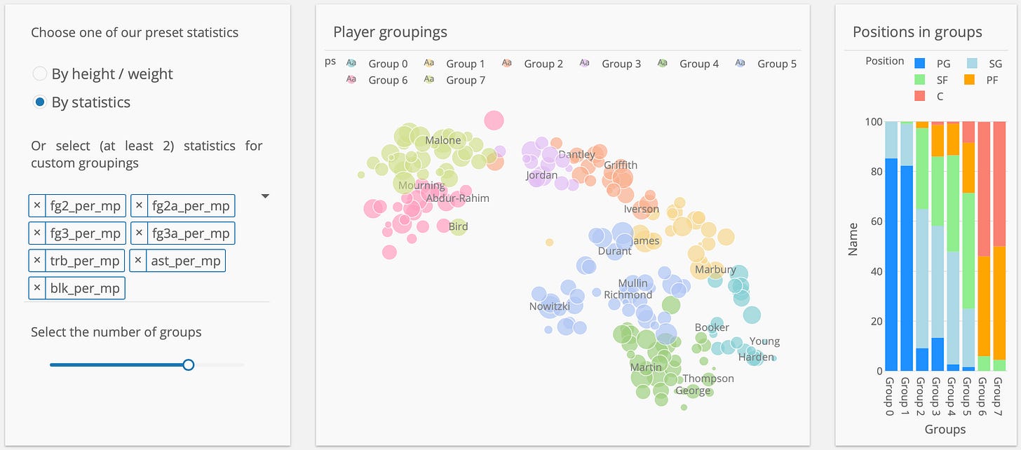
In the middle is a map of a library of NBA players, based on a blend of statistical or physical similarities. Using a machine-learning technique called t-SNE, all of the statistical attributes are squeezed into one (X-)axis, and the physical attributes into another (Y-)axis. Each marker represents a player, coloured by player position and the sized by total minutes played.
To the left is a player selector and options based on which the algorithm can select the players most similar for plotting to the right.
This provides a nice overview and a starting point for us, demonstrating that player attributes can be “squashed” into a scatter plot. The next section builds on this concept, by giving more power to the users.
Firstly, users can choose the parameters for player evaluation. And secondly, the number of groups to cluster the players by, rather than designated positions that can be an inadequate descriptor.
Using this paradigm players like Karl Malone and Alonzo Mourning are grouped together even though they nominally played different positions. And each group’s composition by traditional positions is shown to the right.
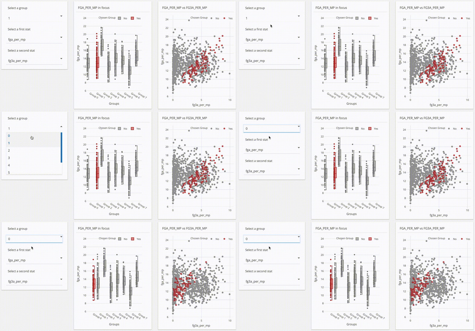
And the next lot of charts begin to delve into each group and the ways in which they might be different to each other. The image below shows that while groups 0 & 1 attempt similar number of field goals (see the box plot in the middle), their rate of attempted three-pointers are vastly different. (See the movement in highlighted groups on the right side chart as group 1 is selected.)
In another example - groups 6 & 7 are compared, each of which comprise about the same proportions of small forwards, power forwards and centres. But take a look at how clearly these two groups differ offensively. Their shot attempts are night and day while the distribution of rebounding stats are similar.
There is a lot more that could be done, but I think this app shows the power of how AI technologies can be used to cluster and explore complex data sets. Imagine how apps like this could be used to speed up player evaluations, or explore potential fits for plugging a hole left by a player who has left.
Check out the player explorer app here
Shot Chart Explorer
Link to shot chart explorer app
We’ve probably seen enough shot charts in the last few years to last a lifetime. Some are very useful, some less so. They’re complicated beasts though, and it can be a huge pain to generate them.
What can be even more challenging is to compare them. There are 30 teams in the league, and how do you even put them all up, and begin to compare them? What about across seasons?
There is a better way!
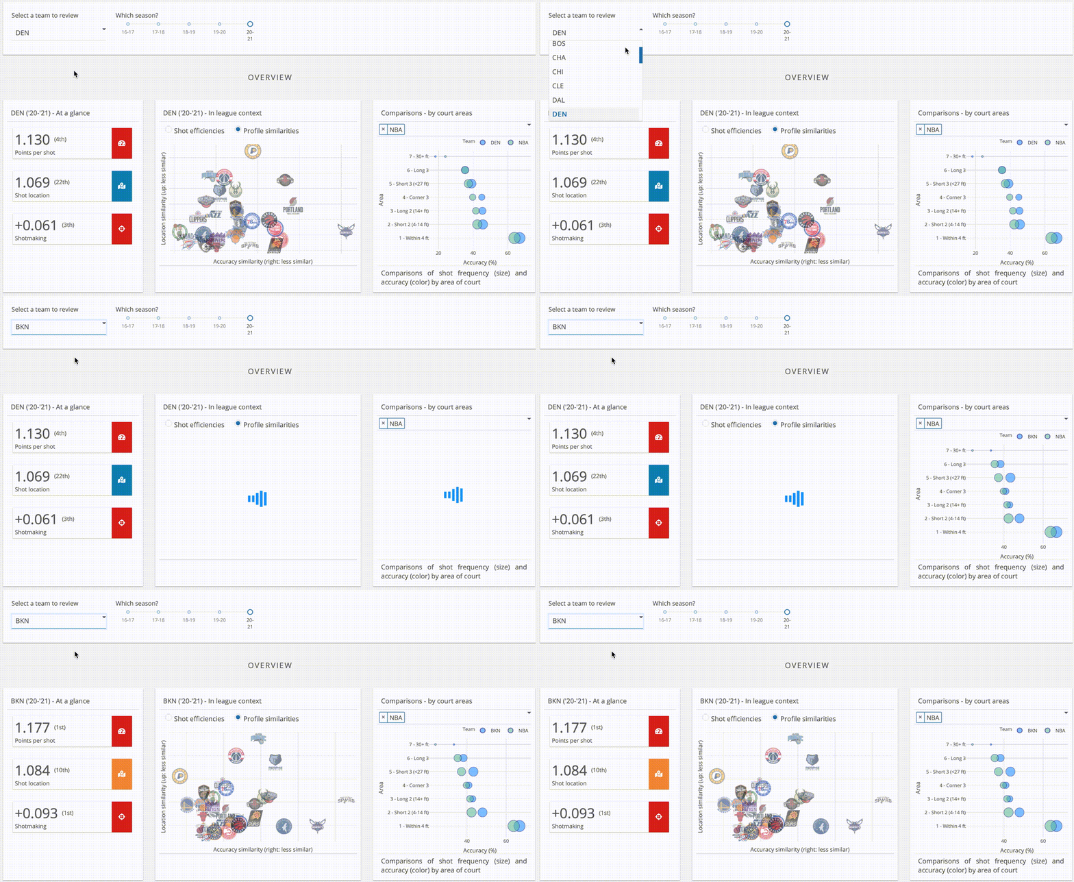
This app does many things, but the thing that is probably the most interesting (to me) is this: it compares shot charts mathematically, so that we can quickly identify how similarly teams’ shot profiles are. Take a look:
The “profile similarities” chart compares teams’ offences in terms of their shot locations (how often they shoot from particular spots), and accuracies (how well they shoot from particular spots).
This way, we can see which teams might be playing similar styles - but they might just be not executing it as well.
And going further, the app looks at how efficient those choices should lead to (based on league-average percentages), versus their actual outcomes.
In other words, teams shown above the dotted line are making more than their fair share of shots (look at the Nets), while those below the line (sorry, Rockets fans) less than their fair share.
Now, that’s something of a simplification, as teams might shoot more from certain spots to maximise their strength relative to the league. But to my eyes it seems to be relatively good representation of the teams’ offensive talent levels.
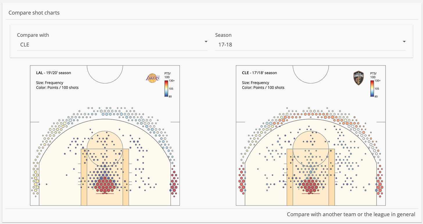
As expected, the app can also display shot charts, allowing comparisons between teams within a season, or across seasons - like comparing these two LeBron teams that got to the Finals.
And then the data is broken down further to explore the impact of variables (see the left of the image below) such as shot clock time, or the closest defender, to the shot locations, measured by average distance. Then we delve deeper into each variable (on the right) by looking at each subset’s shot accuracy against the team average, or the NBA average, grouped by area of the court.
This analysis tells us how each team performs under certain circumstances, and what their weaknesses / strengths might be.
Here we take a look at one of Steph/KD Warriors teams. While the league in general tends to be such that its “catch-and-shoot” shots tend from much further, it is less so for these Warriors.
I would posit that it’s due to having a plethora of extremely skilled players who are not afraid to shoot from anywhere regardless of where the defender is. Sure enough, a look at the right tells us that the team’s average shooting accuracy is well beyond that of the NBA, at any distance, and it only gets better when they are open.
The app also includes a shot chart generator with filters so that we can see what is happening.
I should note that while app is built on offensive data only, but we could easily do the same thing for defensive data.
This is the way.
Check out the shot chart explorer app here
That’s it for now. I hope you enjoy looking at these apps, and maybe they’re useful in a practical sense, or encourage you to build your own.
I definitely had a great time building them, and a huge thanks to Plotly for giving me a chance to work on this project.
Lastly - this is somewhat last minute, but I wanted to let you know that there is an associated webinar where these and other great analytics apps will be shown. (I’ll be on to talk about my apps.)
http://go.plotly.com/sports-analytics
If you’re interested in sports analytics or building AI web apps, I encourage you to join us.


